Documentation
Last Updated: 18-01-26
Institutional Partners List
Managing Institutional Partners
This section acts as the central database for all institutions, museums, and organizations collaborating on the Cultural Programme.
-
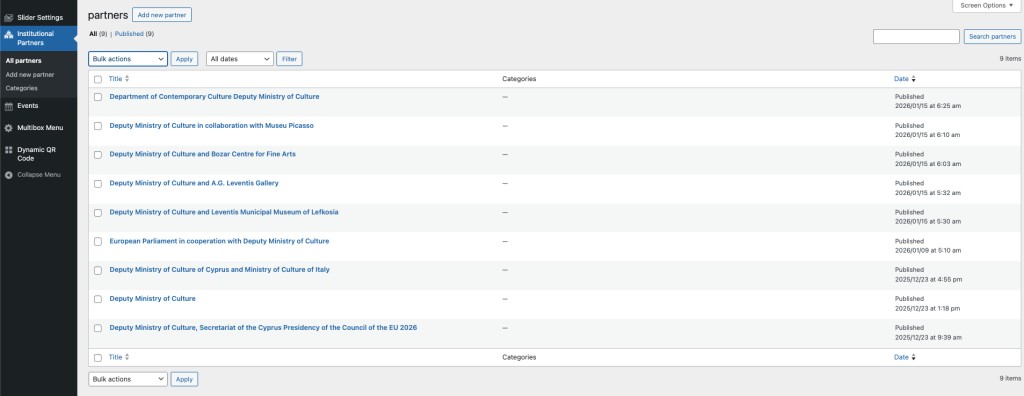
Overview: The main screen displays all registered partners. You can see their publication date and status at a glance.
-
Adding a Partner: Click the “Add new partner” button at the top to create a new profile for an institution.
-
Why this matters: You must create a partner here first before you can link them to an Event. Once added, they will appear in the “Relationships” tab when you are editing an Event.
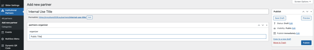
Creating a Partner Profile
The WordPress editor screen for adding a new partner, highlighting the distinction between the “Internal Use Title” and the “Public Title” fields.
When creating a partner, you will notice two different title fields. This distinction is important for keeping your backend organized.
-
Internal Use Title (Top Field): This name is visible only to you in the administration panel. We recommend using a clear, searchable name (e.g., “!Ministry of Culture”) so you can easily find it when linking it to an Event later.
-
Public Title (Organizer Field): This is the official name that will appear on the public website and listing cards. Ensure the spelling and capitalization are exactly how you want the public to see them.
-
Publish: Once both fields are filled, click the blue Publish button on the right to save the partner to the system.
Dynamic QR Code Management
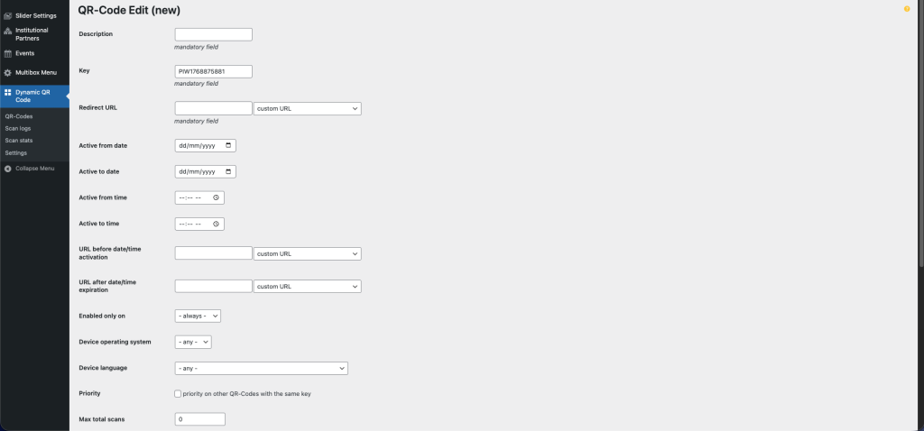
creating and Editing Dynamic QR Codes
The “QR-Code Edit (new)” interface showing fields for Description, Key, Redirect URL, active dates, and fallback URLs for expiration or pre-activation.
This tool allows you to create “Dynamic” QR Codes. Unlike standard QR codes, you can change the destination link of these codes at any time, even after they have been printed on physical brochures or posters.
-
Description: Enter a clear name for this QR code (e.g., “Main Event Brochure”).
-
Redirect URL: This is the primary link where users will be sent when they scan the code. You can update this whenever needed.
-
Active Dates & Times: You can schedule a link to only work during a specific event.
-
Active from/to: Set the exact date and time the link becomes active or expires.
-
-
Fallback URLs:
-
URL before activation: Where users go if they scan the code too early.
-
URL after expiration: Where users go if they scan the code after the event has ended.
-
-
Device & Language: Advanced options to send iPhone users to a different link than Android users, or filter by language.
Advanced QR Settings & Actions
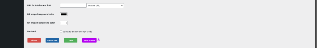
Total Scans Limit: If you want the QR code to stop working after a certain number of people scan it (e.g., for a limited giveaway), enter the maximum number here.
URL for Total Scans Limit: This is the fallback link users will see if they scan the code after the limit above has been reached (e.g., a “Sorry, this offer has ended” page).
Colors: You can customize the Foreground (the dots) and Background colors to match the brand.
Tip: Always ensure there is high contrast (dark dots on light background) so cameras can scan it easily.
Disabled: Check this box to instantly stop the QR code from working without deleting it.
Action Buttons:
Save: Updates the current QR code.
Save as new: Creates a copy of the current settings as a completely new QR code. This is useful if you want to duplicate a complex setup.
Delete: Permanently removes this QR code. Warning: This cannot be undone.
Events
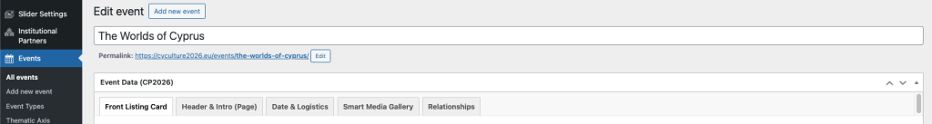
Event Data Tabs Overview
The “Edit Event” interface shows the main WordPress Title field followed by the “Event Data (CP2026)” section, which is divided into five tabs: Front Listing Card, Header & Intro, Date & Logistics, Smart Media Gallery, and Relationships.
Creating an event involves many details, so we have organized the data into five distinct tabs to keep the interface clean. Here is what each tab controls:
-
Front Listing Card: Controls the “First Impression.” Fields here determine how the event looks on the main calendar grid (e.g., the small card image, the short subtitle, and the city filter).
-
Header & Intro (Page): Controls the “Single Page” experience. This includes the main banner (Hero Video or Image) and the detailed analytical description.
-
Date & Logistics: Handles the practical details. You manage dates, times, map locations, documents (agendas), and accessibility info here.
-
Smart Media Gallery: Uploads the visual content. You can create multiple gallery sections or add video embeds here.
-
Relationships: Links the event to people and institutions. This is where you connect the “Institutional Partners” you created earlier.
Front Listing Card: Title & Visuals
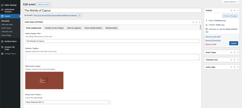
The “Edit Event” screen focused on the “Front Listing Card” tab. Fields visible include Public Display Title, Subtitle/Tagline, Main Poster Image, and Brand Color Theme.
The “Front Listing Card” tab controls the visual snapshot of the event used in the main calendar grid.
-
Public Display Title: This is the official title shown on the card. While the WordPress title (at the very top) is for internal URL generation, this field is what the public actually reads.
-
Subtitle / Tagline: A short phrase appearing just below the title on the card (e.g., “A Journey Through Time”). Keep this concise.
-
Main Poster Image: This is the most critical visual. It acts as the “face” of the event on the grid card and also serves as the default header for the single event page.
-
Brand Color Theme: Select a color (e.g., Blue, Green, Orange) that matches the event’s identity. This color will tint the Date Badge on the card and other accents on the single page.
Front Listing Card: Description & Badges
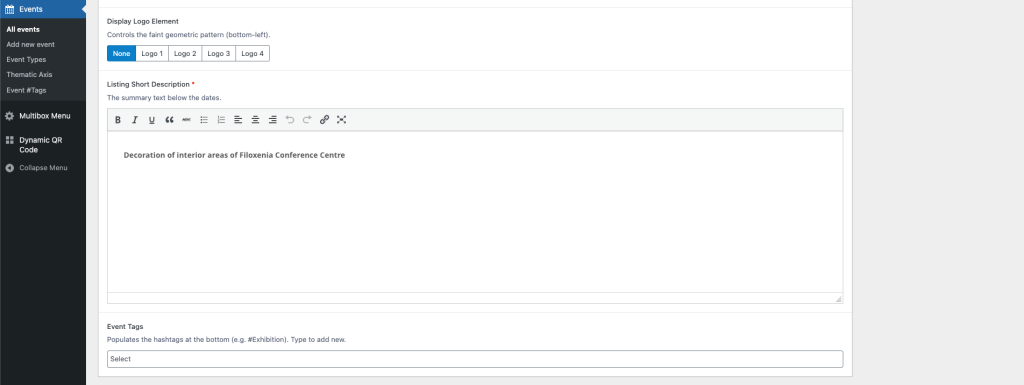
The bottom section of the “Front Listing Card” tab showing the “Display Logo Element” button group, the “Listing Short Description” text editor, and the “Event Tags” selection field.
This section adds the final details to your event card.
-
Display Logo Element: This adds a faint geometric pattern or logo watermark to the bottom-left corner of the card.
-
Usage: Select “Logo 1” through “Logo 4” to apply a predefined brand element, or “None” for a clean look.
-
-
Listing Short Description: Enter a brief summary of the event (approx. 20-30 words).
-
Where it appears: This text sits directly below the date/time on the card. It is the “teaser” text that encourages users to click.
-
-
Event Tags: Add keywords or hashtags (e.g., #Exhibition, #Music).
-
How to use: Click the box to select from existing tags, or simply type a new word and hit “Enter” to create a new tag instantly. These appear at the very bottom of the card.
-
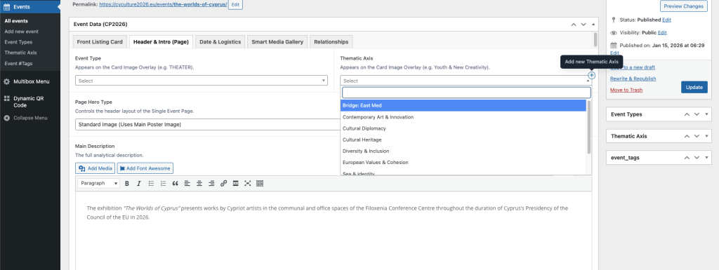
Header & Intro: Categorization & Main Content
Header & Intro (Page)” tab in the Event editor. It shows dropdowns for “Event Type” and “Thematic Axis,” a selector for “Page Hero Type,” and a large WYSIWYG editor for the “Main Description”
This tab manages the “Deep Content” of the event—how it is categorized and the detailed information displayed on its dedicated page.
-
Event Type & Thematic Axis: These dropdowns categorize your event.
-
Display: These selections appear as text overlays on the event card and header images (e.g., “THEATER” or “Cultural Heritage”).
-
Usage: Select the most relevant option. If you need a new category, administrators can add them via the “Add new” button on the right.
-
-
Page Hero Type: This controls the top banner of the single event page.
-
Standard Image: Uses the “Main Poster Image” (uploaded in the previous tab) as a static background.
-
Video Loop: Switching to this option will reveal a file upload field for a silent background video.
-
Minimal: Removes the image entirely for a text-only header.
-
-
Main Description: This is the full analytical description of the event. unlike the short excerpt, there is no word limit here. You can use bold text, lists, and links to provide historical context and full details.
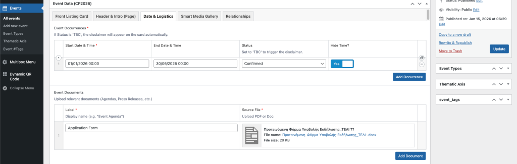
Date & Logistics: Scheduling & Resources
The “Date & Logistics” tab showing the “Event Occurrences” section with start/end dates and status options, followed by the “Event Documents” section for file uploads.
This tab handles the “When” of your event, along with any downloadable resources.
-
Event Occurrences: This section allows you to manage the event schedule. You can add multiple rows if an event repeats on different days.
-
Start/End Date & Time: Click to select the precise timing.
-
Status: Use this to indicate if an event is “Confirmed”, “Cancelled”, or “TBC”. Note: Selecting “TBC” will automatically display a “Dates & Time to be confirmed” disclaimer on the public card.
-
Hide Time?: Toggle this to “Yes” for multi-day exhibitions (like the example shown: Jan–June) where displaying a specific daily clock time is unnecessary.
-
-
Event Documents: This is where you upload files for the public to download.
-
Usage: Ideal for Agendas, Press Releases, or Application Forms.
-
How to: Enter a clear “Label” (e.g., “Application Form”) and upload the corresponding PDF or Word document in the “Source File” column.
-
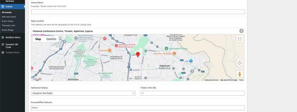
Date & Logistics: Location & Access
The bottom section of the “Date & Logistics” tab showing the “Venue Name” field, the “Map Location” Google Maps interface, and dropdowns for “Admission Status” and “Accessibility Features”.
This section ensures your attendees know exactly where to go and how to enter.
-
Venue Name: Enter the specific name of the building or hall (e.g., “Filoxenia Conference Centre”).
-
Map Location: This is critical for the visual card.
-
How to use: Type the address into the search bar on the map or drag the red pin to the exact entrance. The address displayed here is what will appear on the public event card.
-
-
Admission Status: Select the entry policy.
-
Options: “Free Entry”, “Ticketed”, “Registration Required”, “Invitation Only”, or “Closed”.
-
Ticket / Info URL: If you select “Ticketed” or “Registration”, paste the direct link to the booking page here.
-
-
Accessibility Features: Click to select all applicable facilities (e.g., “Wheelchair Accessible”, “Sign Language Interpretation”). This helps ensure the event is inclusive and compliant with accessibility standards.
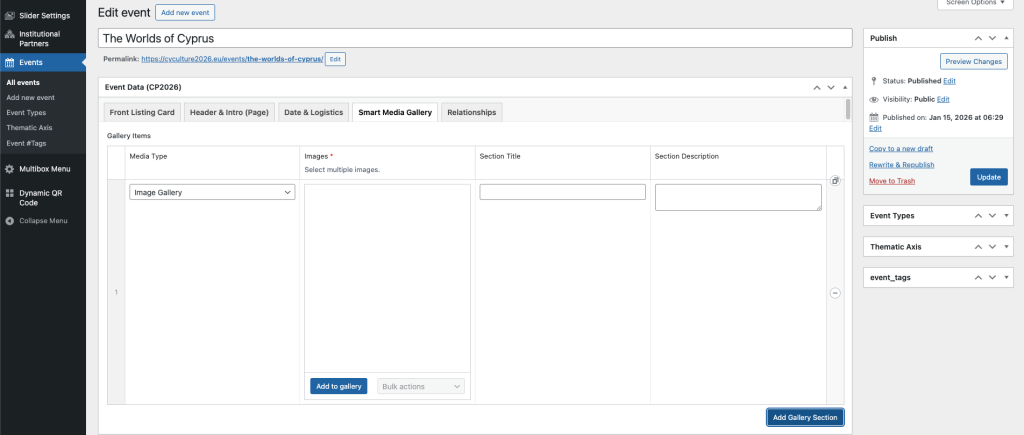
Smart Media Gallery: Images & Video
The “Smart Media Gallery” tab showing a repeater interface. The visible row is set to “Image Gallery” with fields for “Images” (bulk upload), “Section Title,” and “Section Description.”
This tab allows you to build a rich visual experience for your event page. Unlike a simple list of photos, you can organize your media into distinct “Sections.”
-
Media Type: Choose between:
-
Image Gallery: Allows you to upload multiple photos at once.
-
Video: Lets you embed a video (YouTube/Vimeo) or upload a file directly.
-
-
Images: Click “Add to gallery” to bulk select images from your computer or the Media Library. You can drag and drop them to change their order.
-
Section Title & Description: Use these optional fields to give context to your visuals (e.g., “Behind the Scenes” or “Opening Night”).
-
Adding More: Click the “Add Gallery Section” button at the bottom to create a new block. This lets you alternate between a block of photos, then a video, then more photos.
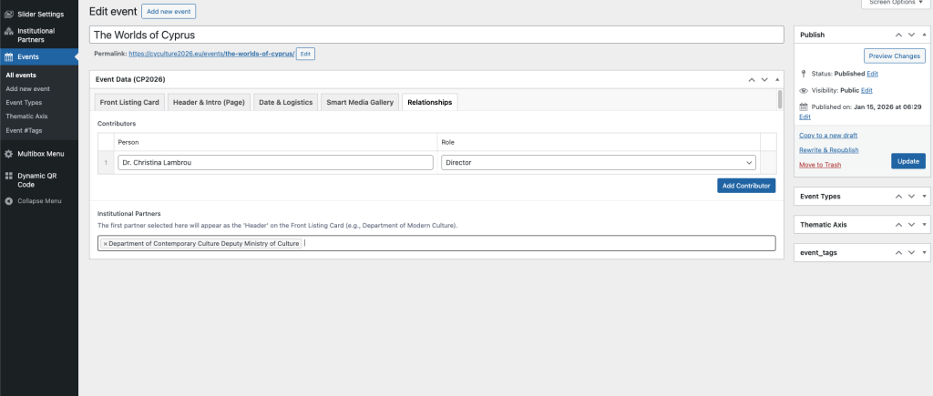
Relationships: Contributors & Partners
“Relationships” tab in the Event editor. It shows a “Contributors” repeater section with fields for “Person” and “Role” (e.g., Dr. Christina Lambrou as Director) and an “Institutional Partners” selection field with one partner added.
This tab connects your event to the people and organizations behind it.
-
Contributors: List the individuals involved in the production (e.g., Directors, Curators, Artists).
-
Person: Type the full name of the individual.
-
Role: Select their specific role from the dropdown menu (e.g., “Director”, “Curator”, “Artist”).
-
Add More: Click “Add Contributor” to list as many people as needed.
-
-
Institutional Partners: Connect the organizations supporting the event.
-
Important Rule: The first partner you select in this list is treated as the “Primary Organizer.” This is the name that will appear at the very top of the Front Listing Card (e.g., “Department of Contemporary Culture”).
-
Selection: Click the field to search for and select partners you created in the “Institutional Partners” section earlier. You can add multiple partners for collaborations.
-
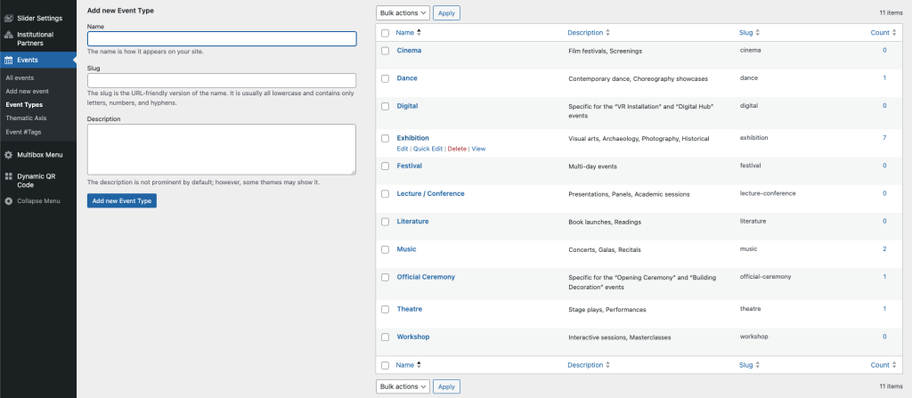
Taxonomy Management (Event Types)
The “Event Types” management screen in WordPress. The left side shows a form to “Add new Event Type” with fields for Name, Slug, and Description. The right side lists existing types (e.g., Cinema, Dance, Exhibition) with columns for Name, Description, Slug, and the Count of associated posts.
This interface is identical for managing Event Types, Thematic Axes, and Event Tags. It allows you to control the filters and categories used across the website.
-
Adding a New Item:
-
Name: Enter the official name (e.g., “Cinema”). This is what visitors will see in the filter menus.
-
Slug: This is the URL-friendly version of the name (e.g.,
cinemaorcultural-diplomacy). You can usually leave this blank, and the system will automatically generate it for you using lowercase letters and hyphens. -
Description: Optional text to describe the category.
-
-
Managing Existing Items:
-
The List: The right side shows all current categories.
-
Count Column: This number tells you exactly how many events are currently using this category. Clicking on the number (e.g., the “7” next to Exhibition) will take you to a list of those specific events.
-
Editing/Deleting: Hover your mouse over any name in the list to reveal the “Edit”, “Quick Edit”, and “Delete” options.
-
Articles – News
Adding new Articles
This section covers how to publish standard press releases and news updates for the presidency. We have streamlined this editor to focus purely on text and images, ensuring all news articles look consistent.
-
Title: Enter the main headline here. This will be the primary link text on the News Feed.
-
Main Content: Use the standard text editor to write your article.
-
Formatting: Use the toolbar to add bold, italics, bullet points, or links.
-
Media: You can click “Add Media” to insert photos directly into the text body if needed.
-
-
Featured Image: (Bottom Right) This is mandatory. You must upload an image here. This image represents the article on the main News grid and serves as the header for the article page.
-
Publishing & Dates:
-
Immediate: Click “Update” or “Publish” to make the article live.
-
Backdating: If you are uploading a press release for an event that happened last week, click the “Edit” link next to “Published on”. Change the date to the past, and the article will correctly slot into the timeline.
-
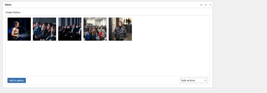
Creating an image Gallery
News Gallery: (Located below the text editor) If you have photos from the event, upload them here.
-
How to use: Click “Add to gallery” to bulk select photos. These will automatically appear as a swipeable slideshow or grid at the bottom of the article.
Slider
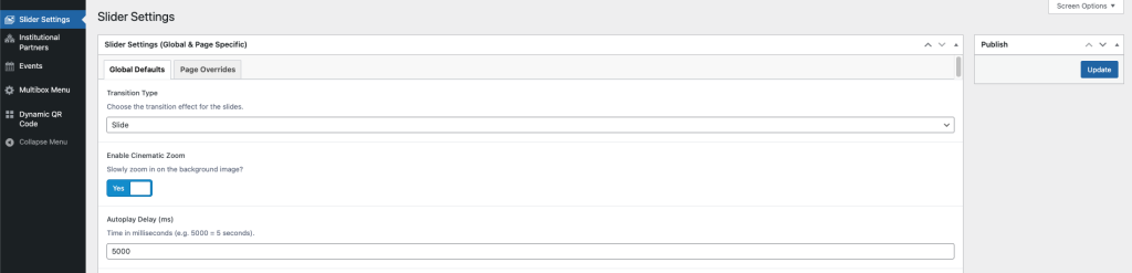
Configuring Global Slider Defaults
This section controls the default behavior for all sliders across the website.
-
Transition Type: Choose how the slider moves between images (e.g., “Slide” for horizontal movement).
-
Enable Cinematic Zoom: Toggle “Yes” to add a slow, subtle zoom-in effect to the background images, creating a more dynamic visual experience.
-
Autoplay Delay: Set the duration (in milliseconds) each slide remains visible before changing. For example, entering
5000equals 5 seconds.
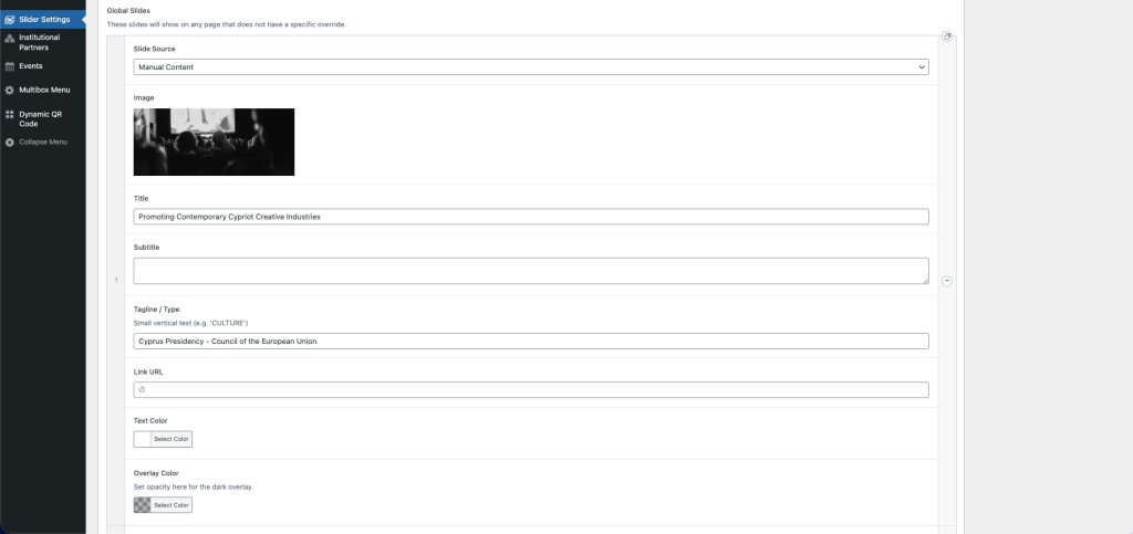
Managing Slide Content
Detailed slide editor showing fields for Image, Title, Subtitle, Tagline, Link URL, and Color settings.
When using “Manual Content,” you have full control over the slide’s appearance.
-
Image: Upload a high-resolution landscape image.
-
Title & Subtitle: Enter the main messaging. The “Tagline” appears as small vertical text (e.g., “CULTURE”).
-
Link URL: If provided, a “Learn More” button will automatically appear.
-
Overlay Color: Use this to darken the image if your text is hard to read. You can adjust the transparency (opacity) to ensure the text pops against the background.
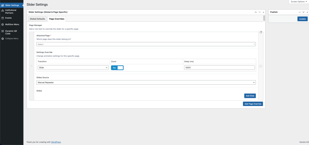
Creating Page-Specific Slider Overrides
Manager” interface allowing a user to select a specific page and override transition, zoom, and slide source settings.
The “Page Manager” allows you to create unique slider configurations for specific pages without affecting the rest of the site.
Attached Page: Select the specific page (e.g., “Home” or “About”) you want to customize.
Settings Override: You can set a different speed or animation style just for this page.
Slides Source: Choose where the images come from:
- Manual Repeater: Manually upload images and text for this specific slider.
- Events Query: Automatically pull the latest “Event” posts.